

Why Jewellery Photos Look Different Online
Table of Contents
- The Science Behind Screen Display: Why Jewellery Photos Look Different Online
- Lighting's Role in Metal and Gemstone Capture
- How to Spot Edited Jewellery Photos
- Jewellery Colour Accuracy Tips for Online Shopping
- Best Practices for Buying Fine Jewellery Online
- Common Jewellery Photography Mistakes and How Retailers Fix Them
- Why Your Jewellery Looks Better (or Worse) in Person
- Conclusion
Last Updated: August 22, 2026
The Science Behind Screen Display: Why Jewellery Photos Look Different Online
When you find a piece of jewellery online that looks stunning in product photos, only to receive something noticeably different in person, you're not imagining things. The disconnect is rooted in how displays render colour, how light behaves across devices, and the gap between controlled studio environments and real-world viewing conditions.
At Diamonds by daisy, we understand this frustration. This guide explores the science behind those visual discrepancies and shows you how to make more confident online jewellery purchases.
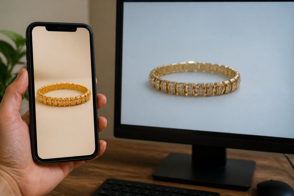
The core issue is that jewellery photos look different across devices because of display technology, colour space mismatches, and how each screen interprets the same digital image. A diamond's brilliance, a gold band's warmth, and a gemstone's saturation can shift dramatically depending on whether you're viewing on a smartphone, tablet, or desktop monitor.
Display technology and colour rendering
Different display types, LCD, OLED, LED-backlit panels, render colours differently because they use different light sources and pixel technologies. An OLED screen produces its own light and typically displays richer blacks and more vibrant colours. An LCD screen relies on a backlight and often appears slightly duller by comparison.
The brightness setting on your device also changes how you perceive jewellery. A diamond photographed under bright studio lights might appear washed out if your screen brightness is low, or artificially brilliant if maxed out.
Colour gamut, the range of colours a display can show, varies significantly between devices. A high-end monitor might display 99% of the sRGB colour space, whilst an older smartphone might only display 85% (cie.co.at). This means certain jewellery tones, especially subtle warm or cool undertones in gold and silver, may not be visible on devices with narrower colour ranges.
sRGB profiles and colour space mismatches
Professional jewellery photographers shoot in sRGB colour space, the standard for web images. However, not every device interprets sRGB the same way. Some smartphones and tablets use proprietary colour profiles that push saturation or shift hues to make images appear more vivid. A rose gold ring might appear more orange on one device and more pink on another.
This mismatch becomes pronounced with gemstones. A sapphire's blue or a ruby's red can shift noticeably if your device's colour profile isn't calibrated to sRGB standards. Most consumers view jewellery photos on uncalibrated devices, which is why the same piece looks different on your phone, your partner's tablet, and your laptop.
Many online retailers also apply their own colour adjustments to product photos before uploading them, brightening images to enhance lustre or increasing saturation to make gemstones look more vivid. These edits compound the colour space issue.
Mobile versus desktop viewing discrepancies
Smartphone screens are typically brighter and more saturated than desktop monitors, which is why jewellery often looks more brilliant on your phone. Smartphone manufacturers increase colour saturation to make images appear more engaging on smaller screens. A diamond ring viewed on a phone might appear almost glowing, whilst the same image on a desktop looks noticeably more subdued.
The viewing distance also matters. You typically hold a phone 20-30 centimetres from your eyes, whilst you sit further from a desktop monitor. This closer viewing distance can make jewellery appear larger and more detailed on a phone, creating an expectation that doesn't match the physical reality when the piece arrives.
Lighting's Role in Metal and Gemstone Capture
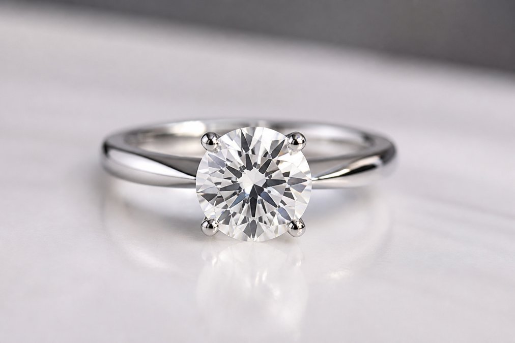
The difference between how jewellery is photographed and how it appears in natural light is dramatic. Professional studio lighting is carefully controlled to eliminate harsh shadows, reduce glare, and maximise the sparkle of gemstones and the lustre of metals.
Studio lighting versus natural light
Studio setups typically use multiple light sources positioned at specific angles to create dimension without harsh shadows. A key light illuminates the primary side of the jewellery, a fill light softens shadows on the opposite side, and accent lights add sparkle to gemstones.
Natural light is unpredictable. A diamond that sparkles beautifully in bright daylight near a window might look dull under office fluorescent lighting. Gold that appears warm and rich in afternoon sunlight might look pale under cool-toned LED bulbs.
The colour temperature of the light source also affects how metals appear. Warm light (around 2700K) makes gold look warmer and more inviting (cie.co.at). Cool light (5000K or higher) makes silver and platinum appear brighter (cie.co.at). A jewellery retailer might photograph pieces under warm light to enhance their appeal, but if you view them under cool office lighting, the colour shift can be jarring.
Specular highlights and glare reduction
Specular highlights are the bright reflections you see on polished metal and faceted gemstones. In studio photography, these are carefully controlled to add sparkle without creating blown-out areas that lose detail. Professional photographers use diffusion panels, polarising filters, and strategic positioning to balance brilliance with visibility.
In real life, specular highlights are much more variable. A diamond that appears to have perfect sparkle in a studio photo might look quite different when you tilt it under a desk lamp at home.
How to Spot Edited Jewellery Photos
Learning to spot signs of heavy editing helps you set realistic expectations for what will arrive at your door.
Common retouching signs and AI-driven editing
Overly smooth metal surfaces are a red flag. Real jewellery has micro-scratches, grain, and patina that give it character. If a gold band looks perfectly flawless with no surface variation, it's likely been heavily retouched.
Gemstone colours that appear unnaturally saturated are another indicator of editing. A sapphire that looks almost neon blue has probably been colour-boosted in post-production. Real gemstones have more subtle colour variations.
AI-driven editing tools are becoming increasingly common in jewellery retail. These tools can enhance colour, remove blemishes, adjust lighting, and even reshape facets digitally. The results look professional but don't reflect the actual product.
Look for inconsistencies in lighting and shadows. If shadows under a ring appear too soft or too sharp compared to the lighting on the band itself, the image has likely been composited or heavily edited.
Raw imagery versus polished post-production
Raw, minimally edited jewellery photos are increasingly rare in online retail, but they're valuable when you find them. A raw image shows the jewellery exactly as it was photographed, with natural imperfections, realistic colour, and authentic sparkle.
Polished post-production images are the industry standard. Retouching isn't inherently dishonest, it's a normal part of professional product photography. The issue arises when editing crosses the line from enhancement to misrepresentation. A light touch that removes dust and corrects white balance is reasonable. Aggressive colour boosting or texture smoothing is misleading.
At Diamonds by daisy, we prioritise accuracy in our product photography, using professional lighting and minimal editing to ensure our online images reflect the actual pieces you'll receive.
Jewellery Colour Accuracy Tips for Online Shopping
Taking control of how you view jewellery photos is one of the most effective ways to reduce the surprise factor when your purchase arrives.
Calibrating your screen for true colour representation
Start by reducing your screen brightness to a comfortable indoor level, typically around 50% of maximum brightness. Jewellery photographed in studios is usually shot under bright conditions, but viewing it on a screen at maximum brightness creates an artificial boost that won't match reality.
Next, check your device's colour settings. Many smartphones and tablets offer a "Natural" or "Standard" colour mode alongside more saturated "Vivid" or "Enhanced" modes. Switch to the most neutral option available.
For desktop monitors, colour calibration tools like Spyder or i1Display Pro can measure your screen's current colour accuracy and create a custom profile. At minimum, adjust your monitor's colour temperature to "Neutral" or "6500K" if those options are available.
The unboxing reality gap and in-person verification
Even with careful online viewing, there's always a gap between the photo and the physical piece. This "unboxing reality gap" is why many jewellery retailers offer return policies. Diamonds by daisy's 30-day satisfaction guarantee gives you time to see the jewellery in your own lighting and decide whether it matches your expectations.
When your jewellery arrives, view it under multiple lighting conditions before deciding to keep it. Check it in natural daylight near a window, under your home's overhead lighting, and under warm desk lamp lighting. This gives you a realistic sense of how the piece will look in your everyday life.
Take close-up photos of your jewellery under your home's lighting and compare them to the retailer's product photos. This side-by-side comparison often reveals how much the studio photography enhanced or altered the piece.
Best Practices for Buying Fine Jewellery Online
Visual consistency across product collections
Reputable jewellery retailers maintain visual consistency across their product collections. This means pieces photographed under the same lighting conditions, with the same editing standards, and against consistent backgrounds give you a more reliable basis for comparison.
When shopping, compare how multiple pieces in the same category appear. If all the gold rings look similarly warm and rich, but one appears significantly more saturated, that discrepancy is a warning sign.
Professional retailers show pieces from multiple angles, top view, side view, and detail shots, so you get a complete sense of the design.
Requesting certification and understanding digital assets
For fine jewellery, certification is crucial. Gemstone certifications from laboratories like the Gemmological Association (UK) provide independent verification of a stone's quality, colour, and characteristics. Request these certificates before purchasing.
Some retailers provide 360-degree product views or video footage that shows the jewellery moving under light. These assets give you a more dynamic sense of how the piece sparkles and changes appearance from different angles.
Ask retailers specific questions about their photography and editing practices. How is the jewellery lit? Is the colour adjusted in post-production? Retailers confident in their products are usually happy to answer these questions.
Common Jewellery Photography Mistakes and How Retailers Fix Them
Harsh shadows, metal overexposure, and gemstone refraction
Harsh shadows occur when a single light source creates sharp, dark areas that obscure the jewellery's detail. A professional photographer uses multiple lights and diffusion panels to soften shadows.
Metal overexposure happens when bright metals like platinum or white gold reflect so much light that they lose all detail. Controlling this requires careful positioning and sometimes the use of polarising filters.
Gemstone refraction, the way light bends through faceted stones, can be difficult to capture accurately. Poor gemstone photography often results in stones that appear either too dark or too washed out.
Clipping paths, background removal, and image compression
A clipping path is the selection boundary used to remove the background from a jewellery photo. Poor clipping work leaves rough edges or uneven borders. Professional retailers use precise clipping to create clean product images.
A white background is standard because it's neutral and doesn't distract from the piece. However, some retailers use coloured or textured backgrounds that can influence colour perception.
Image compression reduces file size for web delivery. Aggressive compression can introduce artefacts that obscure fine detail. High-quality retailers use moderate compression that maintains visual clarity.
Why Your Jewellery Looks Better (or Worse) in Person
Your eyes adapt to lighting in ways that cameras cannot. When you look at jewellery in person, your eyes continuously adjust to brightness, colour temperature, and contrast. A camera captures a single exposure that may not match this adaptive process.
The physical presence of the piece also matters. A diamond that appears brilliant in a photo might feel even more sparkly when you see it catching light in three dimensions.
Psychological expectations also play a role. If you've spent weeks looking at a photo, building anticipation, the real piece might feel slightly disappointing simply because no reality can match a carefully curated image.
The key is to view your jewellery under multiple lighting conditions over several days before deciding whether it meets your expectations.
Buying fine jewellery online requires balancing visual information from photos with an understanding of how those images are created, edited, and displayed. The gap between what you see on screen and what arrives at your door is real, but it's manageable once you understand the technical and perceptual factors at play. Diamonds by daisy's 30-day satisfaction guarantee ensures you can view your jewellery in your own lighting and environment before making a final decision, removing the risk from online fine jewellery purchases. When you choose pieces backed by certification, transparent photography practices, and a genuine return guarantee, you're investing in both the jewellery and the confidence that comes with knowing exactly what you're getting.
Frequently Asked Questions
Why do jewellery photos look different on my phone compared to my laptop?
Different devices use different display technologies and colour profiles. Smartphones typically have higher pixel density but may render colours differently due to their screen calibration. Desktop monitors often display wider colour gamuts. Additionally, screen brightness settings, ambient light, and the device's sRGB profile all affect how jewellery photos appear. A diamond that looks warm gold on your phone might appear cooler on your laptop, even though the image file is identical. Always view jewellery photos on multiple devices before purchasing.
How can I tell if a jewellery photo has been heavily edited?
Look for unnaturally perfect gemstone refraction with no visible imperfections or dust. Edited images often show overly uniform lighting with no harsh shadows or realistic glare. Check metal finishes, retouched photos may display impossibly smooth surfaces without any texture variation. AI-driven editing can create suspiciously symmetrical reflections. Compare product photos across the retailer's collection; if every image looks identically polished, heavy post-production is likely. Raw imagery typically shows minor dust particles, natural light variation, and realistic specular highlights.
What should I look for when buying fine jewellery online to ensure colour accuracy?
Request certification or grading reports that document the gemstone's colour grade and metal composition. Ask retailers for photos taken under different lighting conditions, studio lighting, natural daylight, and indoor ambient light. Calibrate your monitor to an sRGB profile to ensure consistent colour representation. View images on both mobile and desktop devices. Check the retailer's return policy and satisfaction guarantee; reputable sellers like Diamonds by Daisy offer 30-day returns, allowing you to verify the piece matches the online images before committing. Always examine the item in natural daylight once received.
Why does my edited jewellery photo look different when I view it on different screens?
Edited images are often optimised for specific display environments, typically desktop monitors or Instagram feeds. Smartphones and laptops use different colour spaces and brightness levels, causing edited adjustments to render inconsistently. Retouching software like Adobe Lightroom applies changes based on the editor's monitor calibration, which may not translate accurately to your device. Mobile-first editing tends to boost saturation and brightness, making jewellery appear more vibrant on phones but oversaturated on larger screens. Professional retailers manage this by maintaining visual consistency across digital assets and avoiding excessive post-production that won't translate across platforms.
This article was written using GrandRanker